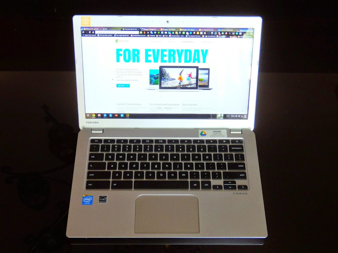
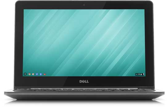
The Toshiba Chromebook 2 (CB35-B3340)
First Impressions
Back in April 2014, I got a Dell 11 Chromebook and posted an article about it. Now, a few months later, I find a Toshiba Chromebook 2 on my lap and have developed some impressions about using it. In this post, I'll cover the same areas I did with the Dell, and add some closing thoughts in comparing the two.I mentioned in my original Dell article that it took me a while to come around to Chromebooks. Not to the idea of them -- which I think is brilliant -- but to the physical incarnations that were available in the marketplace, mostly because of the sluggishness that characterized the early examples of the species. The Dell has exceeded my expectations about how excellent the Chromebook experience can be, and it's now essentially the only keyboard-equipped device I use when I'm not at work.
As I noted in my earlier article, and subsequently on Google+, the Dell's screen, while OK, was for me its weakest feature, so when the opportunity arrived with the Toshiba for a (probably) performant Chromebook with a 13" IPS panel, I ventured to order one sight unseen. After a couple days' use, here's what I think.
Physical
The Toshiba comes in a typical pizza box, packaged in a way designed to keep it from shocks and crushing. You get the Chromebook, a power supply and extension cord, and assorted paperwork for an experienced Chromebook user to ignore.
The Toshiba's case is a fairly shiny blade silver color with a regular woven texture. I admit to a personal bias towards darker colors for laptops, but aluminum casing seems very popular (see how successful Macbooks have been). It seems surprisingly light, but weighs in at about 3 lbs. Design and construction are pretty good, but not exceptional. The feel is a bit plasticky, the interior and exterior surfaces are textured but hard, the seams are good, the hinges seem solid, and the low amount of flex is acceptable in a laptop at this price point. It's a minor point, but my main quibble with the device is how Toshiba designed the power jack. In contrast to what Dell, HP, and other manufacturers provide with their laptops, the narrow-diameter jack doesn't inspire a lot of confidence, and I have a nagging feeling it could develop some durability issues eventually. The Chromebooks's case tapers down to sharp edges, so it's good to have a thumbnail to open it up. If the Dell feels like an Audi, the Toshiba is pure Kia.
 |
| Comparing the Dell and Toshiba power supplies. The Toshiba's is smaller but thicker. Note the difference in jack diameter, as well as cord diameter. |
The Toshiba's keyboard is pretty good, with a fast action, adequate travel, and little mushiness. The keys have a soft-feel surface and are well-spaced. The layout, of course, is standard Chromebook. Not the best keyboard I've ever used, but it's free of annoyances, and doesn't get in the way of typing. Its trackpad is large and responsive, with a much better surface than Toshiba provided with its first generation Chromebook. Tapping is silent, and clicking is crisp and quiet, without the hollow sound I've heard on Acer Chromebooks.
Oh, that screen...
In a word, the Toshiba's screen is gorgeous, and I think the release of this Chromebook may be a watershed moment for screen quality going forward. IPS screens -- or equivalent quality -- should be de rigueur in Chromebooks, and anyone who does an in-person head-to-head comparison with any other competitor in the current marketplace will almost certainly choose the Toshiba for the screen alone. My advice to Asus, Acer, Dell, HP, Samsung, and all you other manufacturers: if you have a Chromebook on your roadmap and it has a TN screen, it's time to sharpen your pencils and go back to the drawing board, because your product's life is likely to be nasty, brutish, and short.
 |
| The Toshiba and Dell side-by-side. Brightness has been set to the same slider position on each monitor. The Toshiba's IPS monitor is probably half again as bright as the Dell's TN panel. |
Toshiba's screen is 13.3 inches with a wide aspect ratio. Color, contrast, brightness, and viewing angles are simply exemplary. Blacks are black, as they should be, and not the deep shade of gray that is characteristic of TN screens. This is a true high definition 1080p panel, and even with 13" on the diagonal, many people will find the current Stable channel of Chrome OS doesn't scale up screen images properly, leaving text too small and difficult to read. Ah, but the Beta channel of Chrome 38 has a flag to set a few scaling parameters to fix this issue, and I expect to see it available in Chrome 38 Stable within a few weeks.
While the screen's surface is shiny, for some reason reflections are not as striking as on the Dell, so in contrast to the latter, that and the IPS panel's brightness should make orientation versus ambient light sources less critical. Text is very crisp, dark, and easily readable, and the wide viewing angles help a lot, as well. So far, I've watched only a couple of YouTube videos, but early indications are this should be a great screen for media consumption. I foresee a date with Pulp Fiction in the near future, and I'll report on that experience.
Media consumption includes sound, and my early impressions of the Skullcandy-branded audio setup are positive, but not jaw-dropping. I'll run some side-by-side comparisons with the Dell and provide my report on Google+, but here's what I have so far. Unlike nearly every other Chromebook currently out there, the Toshiba's speakers are upward-firing, with drivers located under the keyboard. At the right angle to the ears, the sound can be pretty loud and well-defined, but without much bottom end. I can't say much about soundstage and imaging yet. Given the inherent limitations of cranking sound out of a laptop's form factor, one can't expect audiophile-quality music tracks, but perhaps I was hoping for more. Still, these impressions are shallow and preliminary, and I should have a better idea of what we've got here after the speakers have been broken in a bit and I've had a few hours' worth of studied listening and comparison.
Performance
By and large, the standard Intel platform for Chromebooks is transitioning from the 2955U Haswell Celeron to the N2830 and N2840 Bay Trail chipset. This is partly for cost reasons, but primarily because Intel is phasing out Haswell-generation chips to their new Broadwell platform, with mass shipments of the latter to begin in earnest during the 4th quarter of 2014. In fact, it's quite possible that the 2955U, which has served the Chromebook market well over the past year, is no longer being manufactured.
The N2840 in the Toshiba Chromebook 2 definitely doesn't do as well in synthetic benchmarks as the 2955U. Compared with the Octane scores approaching 12000 I get on the Dell 11, early Octane scores on the Toshiba are just under 8000. Does this mean that the user experience on the Toshiba is only about 65% of what it is on the Dell?
Far from it. In a subsequent article, I'll describe the differences between the Toshiba and the Dell using a set of tests similar to those Wesley Files designed to compare Samsung's Chromebook 2 and Acer's Chromebook 3. In the meantime, I have to say that I'd be hard-pressed to identify any performance differences I've noticed in any tasks or operations I've run on the new Toshiba over the past couple days compared with my Dell, on which I've logged many man-weeks over the past several months. Pages render quickly and cleanly (even challenging ones like Google+ and The Verge), multiple tabs don't phase it in the least, and media playback so far is great. The system keeps up with my typing in real time, scrolling is smooth, and multiple window handling is fine. Google Drive content loads quickly (I should mention that my network is plain-Jane 802.11N -- no AC hereabouts yet -- with very good Internet speed and bandwidth).
One other aspect of a Bay Trail Chromebook is that it can be fanless. While the Dell's fan is generally silent, for all intents and purposes, needing or having no fan at all is better, if for no other reason that the fewer mechanical components that may eventually wear out or break, the better.
One aspect of the Toshiba I haven't measured yet is battery life. With my Dell, I get 10 solid hours of work time. Although the Bay Trail chipset is better than sipping energy than a Haswell, I'm going to guess that the larger IPS screen is going to consume more than a smaller TN screen, and that the Toshiba has fewer battery cells. The fact that the two Chromebooks weigh about the same means something had to give, and my money is on the battery.
So while I expect some stress-testing will reveal some measurable differences between the Toshiba and the Dell, in ordinary use I have not yet seen a single performance item that would give me pause, much less impel me to prefer one over the other.
So to wrap for now...
While I haven't used the Toshiba Chromebook 2 long enough or in varied-enough ways to have formed definitive conclusions about it, a couple of things stand out. Were I to stand up my Toshiba and Dell side-by-side and play with them both a bit -- say in the context of an electronics store -- I'd probably select the Toshiba to take home. Why? Well, it's that amazing screen, of course, and the fact that the ergonomics (keyboard, trackpad, etc.) and performance are a wash. The Toshiba just blows away the competition in terms of screen quality. It's almost not a fair competition.
 |
| Comparing the Toshiba and Dell in length and width. Doesn't seem like much, but the Toshiba feels a lot larger in the hand. |
That said, do I think the Toshiba is perfect after so short a time with it? Well, no, and I'm guessing that it won't be the optimal machine for everyone. Here's why. Despite the fact that I think it's -- on balance -- superior to the Dell for most people, the latter's design and build are just nicer than the Toshiba's. I'm guessing the Dell will prove the more durable machine, which may be a deciding factor in some situations (kids around the house, for instance). And though the Dell and Toshiba are about the same weight, an 11 inch machine is inherently more tossable than a 13 inch machine. The Dell's battery life is probably going to be better. This probably makes the Dell a better traveling companion, in a practical if not experiential way.
So what would make the ideal Chromebook? Without getting into touchscreens and convertibles and such, wouldn't a machine with the following characteristics be super?
- 11" 1080p IPS screen (for mobility; a never-leave-home machine might be better with a 13" or 15" screen)
- Broadwell chipset
- 4GB RAM, easily upgradable
- 32GB SSD, easily upgradable
- Fanless
- Good quality upward-facing speakers
- Backlit keyboard
- Dell-quality design and construction
- 802.11 AC wireless
- At least 2 USB 3.1 reversible ports with DisplayPort support
- Charging via USB
- Solid 12 hours of battery life
- Weight equal to or under 3 lbs.


